
ALL YOUR FRIENDS MUSIC FESTIVAL
CLIENT
Republic Live
DISCIPLINES
Art Direction, Brand Identity, Logo Design
SCOPE
Web, Social, OOH, Print
DIRECTION
Nick Coyle
DELIVERABLES
Brand Plate, Line-Up Poster, Festival Logo
YEAR
2023


OVERVIEW
A festival identity built around the music that defined a generation, and the people who never stopped loving it.
All Your Friends is an annual music festival rooted in 2000s-era nostalgia. A celebration of the pop, rock, R&B, and indie music that soundtracked a generation's formative years. The premise is simple and the emotional hook is immediate: this is a festival for people who want to hear the songs they grew up with, in a crowd full of people who feel exactly the same way.


THE CHALLENGE
2000s nostalgia has become one of the most heavily used visual territories in contemporary design. Done lazily, it produces work that reads as costume or a collection of period-accurate fonts and colour palettes that signal an era without capturing any of its energy. Done well, it produces something that actually feels like that time: not a museum exhibit of it, but a live transmission from it.
The challenge for All Your Friends was to build an identity that hit the emotional register of genuine 2000s nostalgia, that immediate visceral recognition, without tipping into pastiche or parody. The festival takes its music seriously. The design needed to match that seriousness while still being fun, bold, and unmistakably rooted in that era's visual culture.
Nostalgia is a feeling, not an aesthetic.
LOGO DESIGN


CHARACTER ICON


THE APPROACH
Start with the feeling. Build the system around it.
The foundation of the creative direction was a single question: what does 2000s music actually feel like? What did it feel like to be in it, or to have been shaped by it? The answer to that question is more useful than any visual reference library. It's energetic, slightly maximalist, deeply sincere, and completely unpretentious about the fact that it's designed to make you feel good. Leaning into the tattoo culture and doodling in you high school textbooks, I morphed a hand-done aesthetic with modern maximilism.
Look & Feel Development - The visual direction was built around the energy and graphic confidence of early-to-mid 2000s music culture. Drawing on the visual language of the era's concert posters, album art, and event graphics without directly quoting any single reference. The goal was a design that triggered recognition without requiring identification: you feel the era before you can name why. Bold typography, a high-contrast colour palette, and a graphic density that rewards attention were the core tools.
Festival Poster - The anchor of the visual identity was the festival poster. The primary public face of All Your Friends and the piece that established the full Look & Feel in one image. The poster had to carry the complete identity: the tone, the era, the energy, the lineup hierarchy, and the brand. Everything downstream flowed from it.
Brand Plate - Once the Look & Feel was established through the poster, it was codified into a brand plate. A structured document capturing the core visual elements of the identity in a form that sponsors and other designers could use to produce consistent materials independently. A brand plate of this kind is a practical piece of infrastructure: without it, a festival with multiple design contributors quickly becomes visually incoherent. With it, the identity holds across every application, regardless of who produced it.
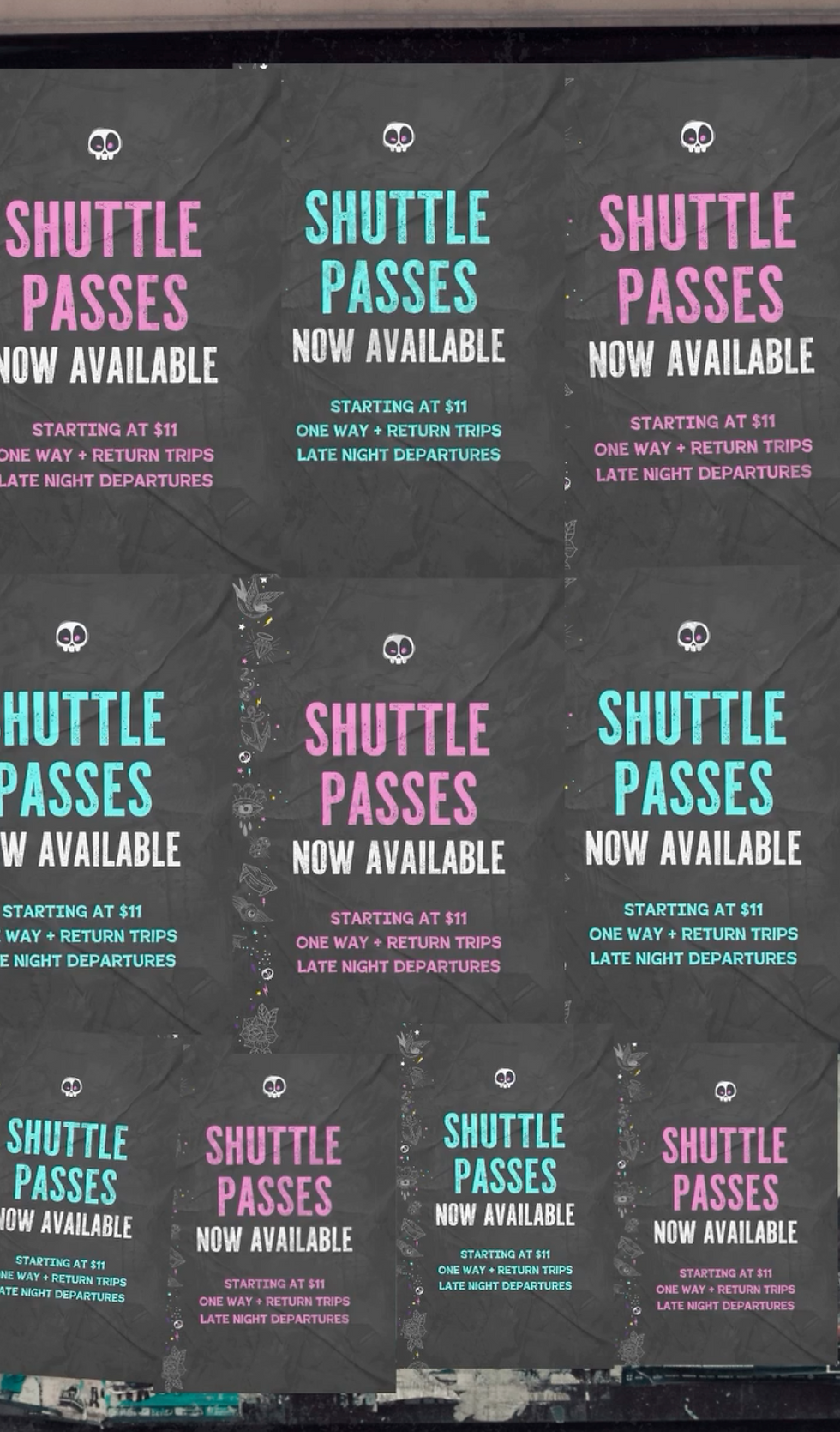
Single-Day Social Graphics - Friday and Saturday were each given their own social graphics, built from the brand plate, formatted for Facebook and other social platforms, and designed to function as day-specific promotional assets. The day graphics shared the core identity but carried enough individual character to feel like distinct announcements rather than copies of the same template.
THE APPROACH



CONLUSION

The measure of a well-built festival identity isn't just how it looks on the poster. It's how it holds up when thirty different people are using the brand plate to build their own materials, when the Friday graphic is running alongside the Saturday graphic in someone's feed, and when the sponsor activations on the day look like they belong to the same event as everything else. That's what a properly constructed brand system does, it does the work of the designer even when the designer isn't in the room.
All Your Friends launched with a visual identity that was immediately legible, emotionally resonant, and robust enough to be used at scale across multiple production teams rooted in a genuine understanding of what makes 2000s nostalgia feel earned rather than exploited.

© NICK COYLE CREATIVE. COPYRIGHT 2026