2023 CANADIAN SCREEN AWARDS
Client
Academy of Canadian Cinema & Television
Disciplines
Art Direction · Brand Identity · Motion Design · 3D
Scope
Broadcast · Social · Print
Creative Direction & Design
Nick Coyle
Deliverables
200+ Assets Across All Platforms
Year
2023

OVERVIEW
Building a new visual language for Canada's premier screen celebration.
The Canadian Screen Awards is Canada's most prestigious celebration of excellence in film, television, and digital media. For the third consecutive year, Nick Coyle Creative was engaged as design lead and tasked with a full visual rebrand that needed to feel bold, cinematic, and unmistakably new. This wasn't an iteration on previous work. Starting from a blank canvas, the mandate was to conceive a complete visual identity system. One that could scale across the complexity of a live broadcast event while remaining visually cohesive across social, print, and motion.

THE CHALLENGE
Delivering a full rebrand at broadcast scale, across multiple platforms, under the time pressure of a live awards cycle is a different challenge than a typical identity project. Each constraint compounded the others.
Original Rebrand
With no existing system to evolve every visual decision from colour, typography, motion language, graphic guidelines had to be built from the ground up while staying true to the prestige of the awards.
Cross-Platform Consistency
With no existing system to evolve, every visual decision from colour, typography, motion language and graphic vocabulary. It had to be built from the ground up while staying true to the prestige of the awards.
Scale Under Pressure
Over 200 individual deliverables spanning show title cards, nominee packages, winner lower thirds, social graphics, and print collateral. All produced within the compressed timeline of an awards production cycle.
Bold Without Alienating
The brief called for a cinematic, forward-facing identity that felt genuinely fresh, while still honouring the heritage and gravitas expected by an audience that has watched these awards for decades.


Identity Architecture
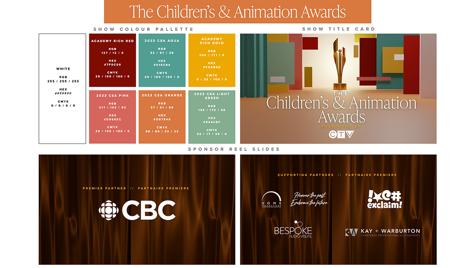
Before a single asset was designed, a comprehensive Design Guidelines document was established defining the colour system, typographic hierarchy, motion principles, and compositional grammar. This became the single source of truth for all downstream production.
The design process began with a single question: what does the future of Canadian screen culture look like? The answer shaped every decision that followed — from the macro identity system down to the micro details of a winner's lower third.
THE APPROACH
Look & Feel Development
Multiple creative directions were explored to pressure-test the brief. The chosen direction; a bold, cinematic feel rooted in a sense of spectacle. This was developed into a full visual language that could express itself equally across a 16:9 broadcast frame and a 4×5 social crop.
System & Template Build
Rather than designing assets individually, a modular template system was built to enable rapid, consistent production at scale. This approach allowed the volume of deliverables of over 200 assets to be executed without sacrificing design quality or brand consistency.
Broadcast & Social Execution
Final asset production spanned broadcast graphics – show title cards, nominee packages, winner lower thirds), social content (static and motion), and print collateral all executed within the compressed timeline of live awards production.

LOOK & FEEL DEVELOPMENT




BROADCAST GRAPHICS


GRAPHIC PACKS

SCALE & SOCIAL EXECUTION


CONCLUSION
A full visual identity built from nothing, scaled to broadcast, and delivered on time.
200+ assets produced across broadcast, social, and print — all within a single cohesive identity system.
Original visual Identity for 2023 — a new visual language conceived, developed, and executed within the compressed timeline of an awards cycle.
Creative asset guide for vendors — a new visual language conceived, developed, and executed within the compressed timeline of an awards cycle.
Seamless cross-platform consistency maintained from 4K broadcast screens to social media thumbnails and printed programmes.
Third consecutive year retained as design lead — testament to a trusted, long-running creative partnership.

© NICK COYLE CREATIVE. COPYRIGHT 2026
